Spring time inspires ...
Find the original photo full size at http://snapshots-1.over-blog.com/photo-2054324-no35-westendorf-2003_JPG.html
ornamental abstractions
by veronika bernard
Ornamental abstractions shows digital art works of the ABSTRACTIONS project by veronika bernard.
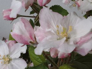
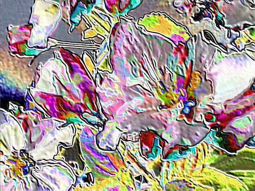
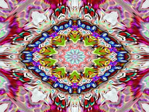
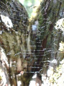
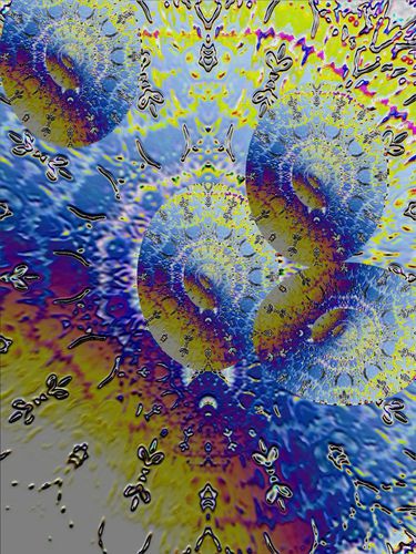
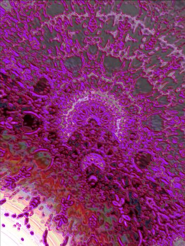
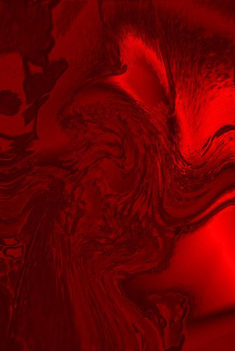
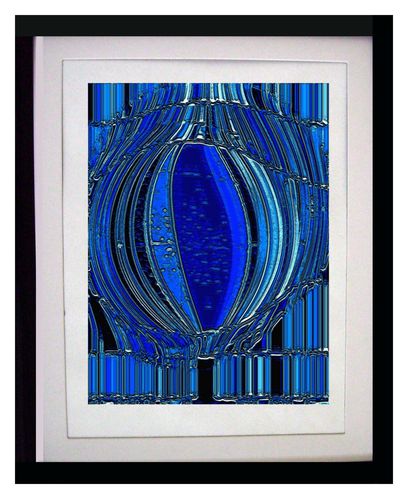
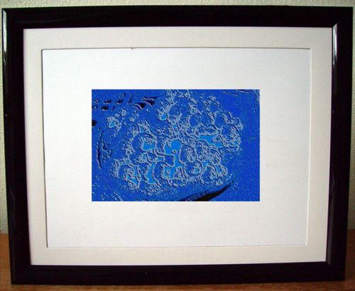
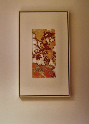
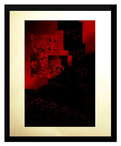
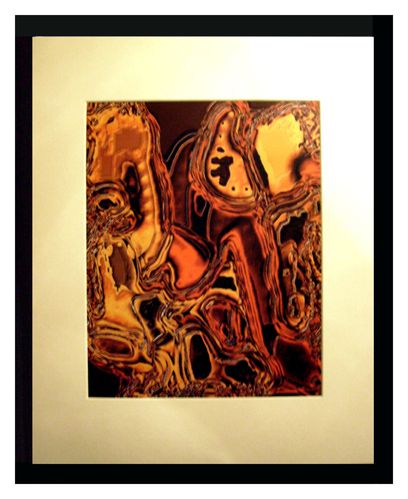
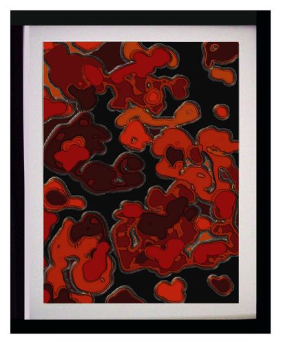
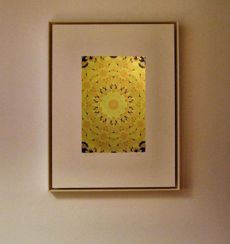
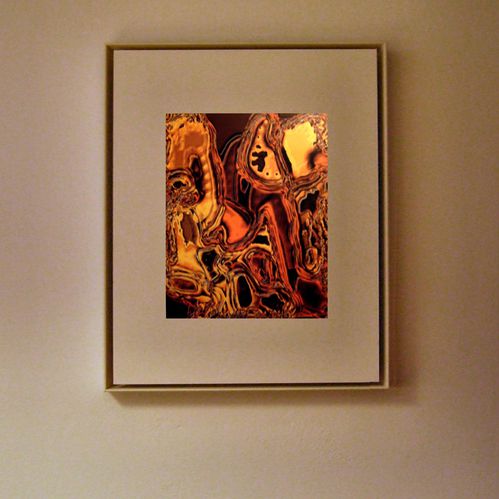
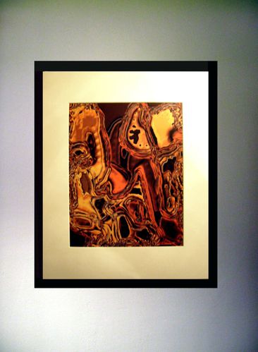
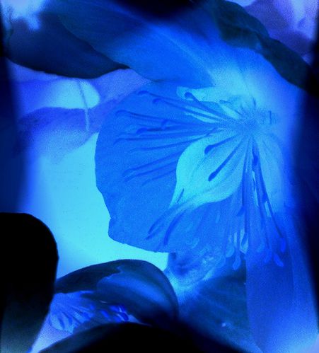
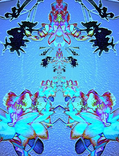
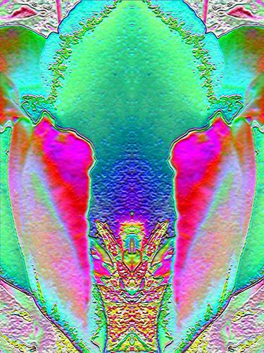
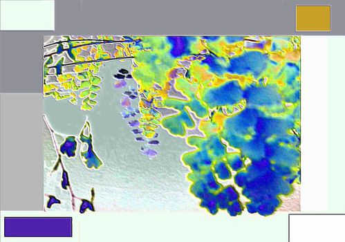
Ornamental Abstractions is a digital arts project based on photography by Veronika Bernard.
The central idea of the project is to lift the colour potential and the ornamental structures present, but hidden, in photos to the surface of the final images.
Different filters are used on photos shot with a digital camera; occasionally parts of the photos are re-arranged in the process.
The works are finalized by producing a digital colour print on matt white cardboard, matt white paper (350 gram minimum) or white cotton, ranging from A4 to A3 in size; or on canvas ranging from A4 to A1 (or even larger sizes).
The works are available for exhibitions and for private use.
If you are interested in printed copies of the works or in printable quality files indicating the author’s copyright, please contact: ornamentalabstractions@gmx.at
The original photos go to Veronika Bernard’s Snapshot project and are available for exhibitions, print media and online media use.
For Veronika Bernard’s Snapshot project see http://snapshots-1.over-blog.com
Spring time inspires ...
Find the original photo full size at http://snapshots-1.over-blog.com/photo-2054324-no35-westendorf-2003_JPG.html
A spider web and its ORNAMENTAL ABSTRACTIONS ...
Find the original photo at http://snapshots-1.over-blog.com/photo-2054324-no100-westendorf-2004_JPG.html
Even if you like what you see the creative process with ORNAMENTAL ABSTRACTIONS images need not end at that point.
Every image is open to further creative work. None of them is the final step in the process ...
See some of the latest deriving from the following ORNAMENTAL ABSTRACTIONS image.
veronika bernard: ornamental abstractions image no. 11 (2004)
For more go to http://ornamentalabstractions.over-blog.com/pages/ornamental-abstractions-latest-6775633.html or http://ornamentalabstractions.over-blog.com/album-2034274.html
Whenever an image goes somewhere it is a special moment.
In 2010 the following two images went to Serhan Oksay, an Istanbul based photographer and university professor.
The next one has been decorating a wall in an office at the Raiba Westendorf branch of Raiba Raiffeisenbank since 2005.
And in 2004 the next two ones went to Ender Atesman, a then Ankara based university professor.
Like with framing images also with using mounts on them it is all about underlining the aestethic potential of the image. This not only includes the decision whether to use a passe partout but in case you decided to do both size and colour of the passe partout.
And the general rule with this again is:
The colour of the mount ought to correspond with the image. A plain white mount is not always the perfect choice.
The size of the mount ought to be chosen in a way that the mount will focus the viewers attention on the central motive of the image.
Have a look at the following examples to see the difference between the same image being framed using a mount and being framed without and the effect of the mount colour.
The choice of frame style and colour is the most relevant decision next to the one concerning the use of glass in framing ORNAMENTAL ABSTRACTIONS images.
A classical frame colour is black, of course. It looks good on most images.
However, the main point in deciding on the frame colour is that it ought to correspond with the dominating colours of the ORNAMENTAL ABSTRACTIONS image and that it supports the ornamental structure of the image.
You can esaily see this with the following examples:
Using a matt black frame in a classical shape and style on this image both underlines the effect of the colours and produces a natural margin.
Using a very slim frame of the same light and soft white of the passe partout with the following image highlights the darker colours of the also slim ornamental motive in the centre of the image.
The fact that the image is same level with the frame adds to this effect and makes the image appear larger. The shadow produced by the small gap between passe partout and frame serves as a virtual margin with this non-mainstream type of frame.
The difference in effect can also be seen very well, when framing the same image in two different ways.
Finally, also the wall colour should be considered in chosing the right frame for an ORNAMENTAL ABSTRACTIONS image. The relevant point with this is: contrast or correspondence.
As you see from the above examples both is possible.
This selection of ORNAMENTAL ABSTRACTIONS images was created in 2010 and 2011.
See more on http://ornamentalabstractions.over-blog.com/pages/ornamental-abstractions-2010-2011-selected-6775625.html or http://ornamentalabstractions.over-blog.com/album-2027346.html
This selection of ORNAMENTAL ABSTRACTIONS images was created during 2007, 2008, and 2009.
See more on http://ornamentalabstractions.over-blog.com/pages/ornamental-abstractions-2007-2009-selected-6775621.html or http://ornamentalabstractions.over-blog.com/album-2027335.html
This selection of ORNAMENTAL ABSTRACTIONS images has been created in 2005-2006.
See more on:
http://ornamentalabstractions.over-blog.com/pages/ornamental-abstractions-2005-2006-selected-6635262.html or http://ornamentalabstractions.over-blog.com/album-2020419.html
Ornamental abstractions 2003-2004 includes early ORNAMENTAL ABSTRACTIONS works which have been created in 2003 and 2004.
From top to bottom:
veronika bernard: ornamental abstractions image no. 11 (2003)
veronika bernard: ornamental abstractions image no. 4 (2003)
veronika bernard: ornamental abstractions image no. 21 (2004)
veronika bernard: ornamental abstractions image no. 104 (2004)
See more on:
http://ornamentalabstractions.over-blog.com/pages/ornamental_abstractions_20032004_selected-6062834.html or http://ornamentalabstractions.over-blog.com/album-2019939.html